A fresh coat of paint is one of the fastest ways to completely reshape how a room feels. Unlike major renovations, interior paint ideas offer immediate impact without the months of dust and disruption. Whether you’re looking to boost resale value, create a calm retreat, or inject personality into a bland space, the right color transforms walls into the foundation of great design. This guide walks through seven proven interior paint ideas, from timeless neutrals to bold statements, with honest advice on execution, material selection, and when to bring in a professional. Each approach pairs practical tips with enough detail to help you make decisions that match your home’s style and your DIY comfort level.
Table of Contents
ToggleKey Takeaways
- Interior paint ideas transform rooms faster and more affordably than major renovations, offering immediate visual impact without months of disruption.
- Warm neutrals like greige and soft taupe are timeless choices that work with any décor, but must be tested with 2-by-3-foot sample patches in natural light for 48 hours before committing.
- Bold feature walls in jewel tones anchor a room when painted on the wall opposite the entry or behind furniture, requiring premium paint with high pigment load and tinted primer for best results.
- Cool tones such as soft blue and sage green naturally promote calm and restfulness in bedrooms and offices, but demand extra wall preparation since they reveal imperfections more readily.
- Color blocking with two bold walls and neutral remaining walls creates modern, zone-defined spaces—success depends on restraint, quality painter’s tape, and thin, layered coats for crisp transitions.
- Proper prep work including TSP washing, sanding, priming, and using high-quality rollers and brushes is non-negotiable for professional-looking results regardless of color choice.
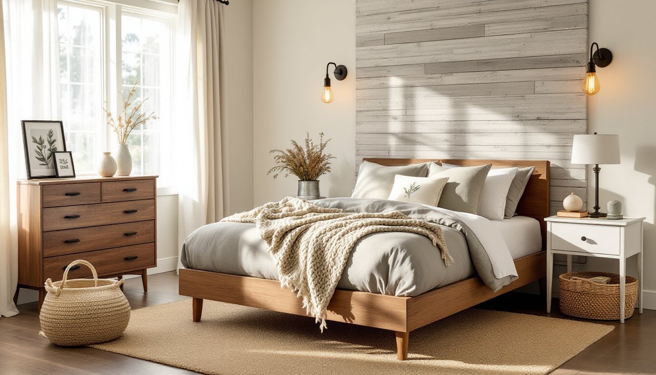
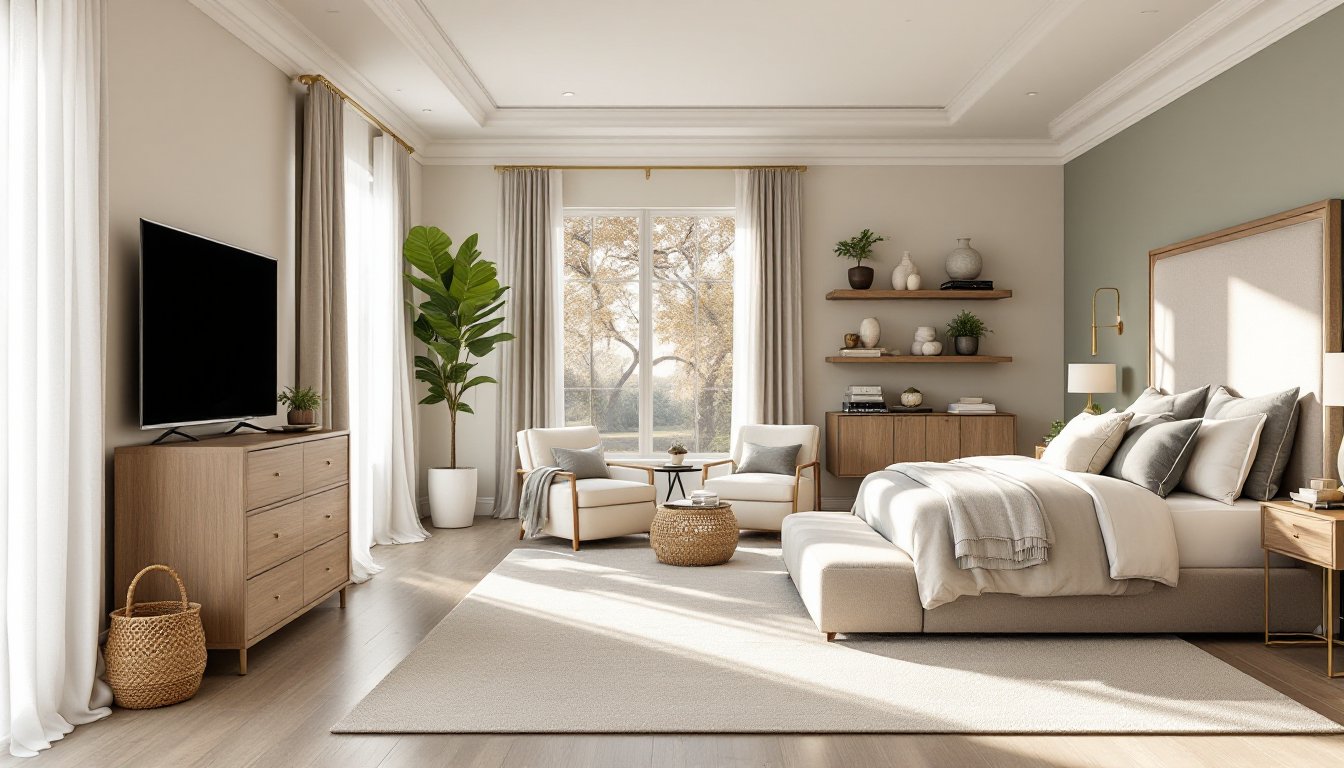
Warm Neutrals for Timeless Sophistication
Warm neutrals, think greige (a gray-beige blend), soft taupe, and warm white, remain the safest bet for homeowners who want polish without risk. These colors work because they don’t compete with furnishings, they photograph well for resale, and they adapt to changing décor over time.
Warm neutrals reflect light differently depending on undertones. A true warm white contains subtle yellow or red undertones, while greige balances cool and warm for flexibility. When selecting, always paint large 2-foot by 3-foot sample patches directly on your walls in the spaces where light hits most. Natural north-facing light reveals cool undertones: south-facing rooms show warmth. Wait 48 hours before deciding, paint color shifts as it cures.
For prep, this is non-negotiable: wash walls with TSP (trisodium phosphate) or a quality degreaser, sand glossy surfaces with 120-grit sandpaper, and fill nail holes with spackling compound. Prime any patched areas or new drywall with quality primer (not paint-and-primer combos, they skimp on coverage). Use a 90/10 roller setup: 90% of your coverage comes from a high-quality 3/8-inch nap roller on flat walls: 10% comes from a brush for corners and trim.
Two coats usually suffice for warm neutrals over existing light colors. Allow 24 hours between coats. For trim and doors, consider a slightly warmer off-white to create subtle definition without jarring contrast. Top Home Renovation Ideas to Transform Your Space often feature warm neutrals as the foundation for successful room redesigns.
Bold Feature Walls That Make a Statement
A bold feature wall, painted in jewel tones like emerald green, deep navy, or rich terracotta, anchors a room without overwhelming it. The trick is choosing the right wall and executing with confidence.
Choosing the Right Wall for Impact
Pick the wall that draws your eye naturally when you enter the room. Usually, that’s the wall behind a bed, sofa, or above a fireplace. Avoid painting the wall with the most windows: natural light will fade the color unevenly and make maintenance harder. The wall opposite the entry is ideal, it becomes an instant focal point.
Bold colors demand premium paint with high pigment load. Budget brands stretch solids and require three coats: quality paint delivers in two. Expect to pay 30–50% more, but the finish stays truer longer. Primer becomes essential here. A tinted primer matching your bold color cuts through existing wall color faster and improves final coverage.
Application technique matters. Brush all edges and corners first with a 2-inch angled brush, working in 2-3 foot sections. Follow immediately with a roller to maintain a wet edge and avoid lap marks. Let the first coat dry fully (check the can, usually 4 hours minimum), then apply a second coat. Cheap rollers shed fibers into bold colors: invest in a lint-free microfiber roller.
For gloss and durability on high-traffic walls or walls prone to splashes, add matte or satin sheen instead of flat. Satin reflects light subtly and wipes clean without the plastic look of eggshell. Home Renovation Ideas and Tips for a Successful Project includes guidance on material selections that ensure long-term results.
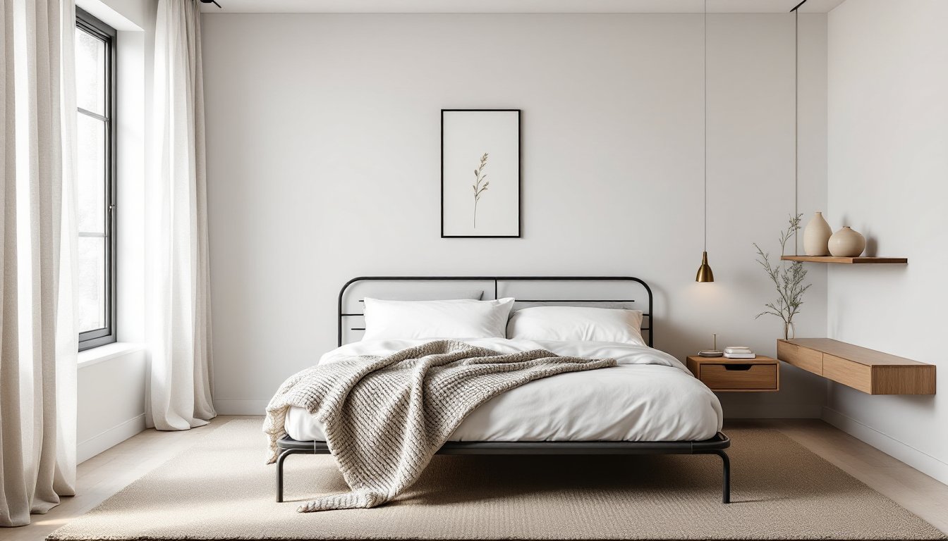
Cool Tones for Calm and Serene Spaces
Cool tones, soft blues, sage greens, cool grays, and icy whites, naturally slow down the eye and lower perceived temperature. These work exceptionally well in bedrooms, bathrooms, and home offices where tranquility matters.
Cool colors feel more restful because they mimic sky and water, triggering a calm response in the brain. Soft sage green pairs with natural wood and stone without feeling clinical. Dusty blue works with brass fixtures and warm metals to avoid coldness. Cool gray reads sophisticated paired with white trim, but can feel sterile without the right undertones, avoid pure grays: seek ones with subtle blue or green undertones instead.
Cool tones can highlight wall imperfections because they absorb rather than reflect light. Pre-painting wall prep is even more critical. Fill any cracks, smooth rough patches with 220-grit sandpaper, and use quality all-purpose primer on bare drywall. Spot-prime large repairs so primer doesn’t show as darker patches after paint dries.
When applying cool tones, maintain consistent humidity and temperature during curing. Cold, damp rooms make paint cure slowly and can cause slight color shifts. Open windows for air circulation, but not so much that the room becomes drafty. Allow 72 hours of curing before moving furniture back against walls. According to House Beautiful, cool tone palettes are among the most requested interior design trends for 2026, particularly for creating restorative home environments.
Color Blocking for Modern, Creative Rooms
Color blocking, painting two or more bold colors on different walls or sections within a single room, creates visual interest and can define zones in open-concept spaces. Done well, it feels intentional: done poorly, it reads chaotic. Restraint and planning prevent the latter.
Start with a color scheme that works together. Pick a primary wall color, then choose a complementary or analogous accent. Online tools like color wheel apps help verify harmony. Analogous colors sit next to each other (blue and blue-green) for subtle richness. Complementary colors sit opposite (blue and orange) for bold contrast. Test both colors on your walls with large sample patches before committing.
Combining Complementary Colors Successfully
The golden rule: use bold colors on no more than two walls, and keep the remaining walls neutral. If you paint four walls in competing hues, the room becomes exhausting. One wall in deep teal, an adjacent corner wall in warm cream, and remaining walls in neutral gray creates dynamic balance. The eye travels but never rests uncomfortably.
Execute crisp color transitions with quality painter’s tape (not the cheapest hardware-store variety, spend the extra $3). Apply tape along the edge where two colors meet, burnish it firmly, paint the first color, let it dry 24 hours, then tape the edge of that color and paint the second. Remove tape while paint is slightly tacky (not bone-dry) to avoid peeling. Use 2–3 thin coats rather than one thick coat for even coverage and clean edges.
Color blocking works especially well in nurseries, playrooms, and modern home offices. Home Renovation Ideas Examples to Transform Your Space showcase contemporary approaches where creative color combinations define functional zones without physical walls. Refer to Addicted 2 Decorating for accessible tutorials on executing color-blocked rooms on a homeowner budget.
Conclusion
Interior paint ideas offer the highest return on effort and budget in home improvement. Whether choosing timeless warm neutrals, bold feature walls, serene cool tones, or creative color blocking, success hinges on honest prep work, quality materials, and patience during application. Sample large patches, invest in primer and quality paint, and take your time with technique. These seven approaches give any homeowner the framework to refresh a room with confidence and create a space that feels genuinely theirs for years to come.